Stadium Operations Reimagined: FIFA World Cup 2022
5–6 min → ~2 min incident response | 8 stadiums unified | 64 matches, zero design-level failures

Overview
I audited the inherited wireframes against live operational data and found a structural flaw: the information architecture treated all four operator roles as one. I built the evidence case for a full IA restructure mid-project on UNISTAD, the command platform that unified operations across 8 FIFA World Cup stadiums. Stakeholders approved it based on journey maps and task-timing data. The result: incident response dropped from 5–6 minutes to under 2 across 64 matches.
Context
- My Role
- UX/UI Designer II: owned end-to-end design for every feature from discovery through deployment support
- Hats Worn
- UX Design, UI Design, User Research, Interaction Design, Design Systems, Stakeholder Management, Dev Handoff, On-Site Validation
- Year
- 2021–2022
- Duration
- 10 months
- Company
- Johnson Controls
- Product
- UNISTAD (Unified Stadium Operations Command Center)
- Team
- 2 UX designers, 15+ developers, Accenture Agency, Microsoft, external stadium management and CCTV specialists
- Client
- INTALEQ (Aspire Command and Control Center, Doha, Qatar)
- Platform(s)
- Web: Desktop + large-screen display (up to 75.59 ft wide)
- Made With
- Adobe XD, Figma, Miro, Webflow, Microsoft Azure, OpenBlue Platform
- Sprint Cadence
- Two-week sprints with iterative usability feedback each cycle
- Project Status
- Launched. Deployed live for FIFA World Cup 2022, November–December 2022
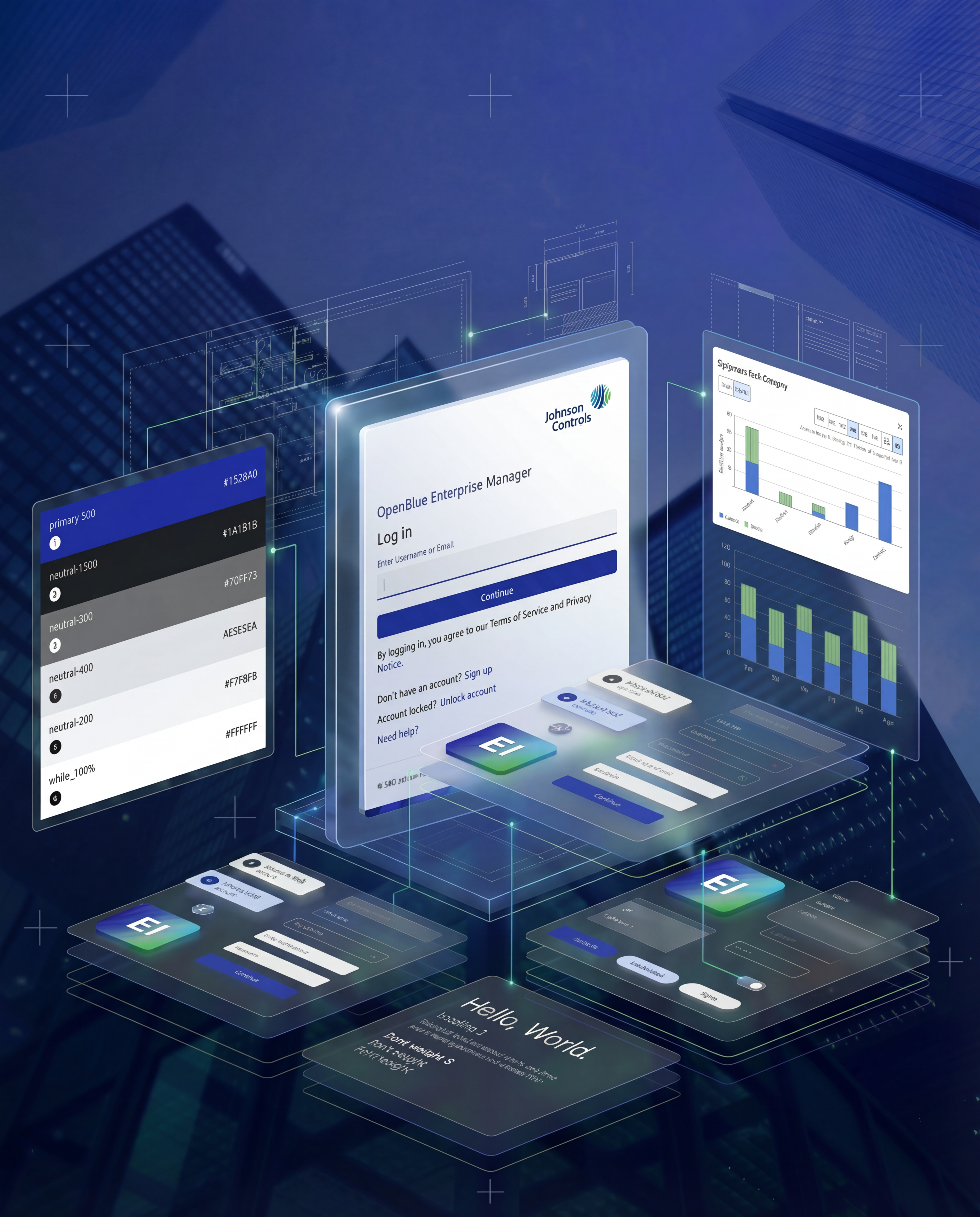
Confidentiality Notice: Due to legal and security requirements, the final production dashboard interface cannot be shown in its entirety. The work presented here reflects the design process, methodology, and representative artifacts. Impact metrics are sourced from post-deployment measurement.
Constraints: 10-month hard deadline: the World Cup opening ceremony doesn't move. Remote collaboration across 3 time zones (US, India, Qatar), working in two-week sprints. No existing design system or component library. The 75-foot display wall was inaccessible for design preview until one month before launch.
What I Owned vs. What I Inherited
- Product direction aligned between Microsoft, INTALEQ, and Johnson Controls
- Working data infrastructure (Microsoft Azure, OpenBlue Platform)
- Stakeholder workshops and initial discovery findings
- Initial wireframes built against assumed, not actual, data models
- Four identified user personas with preliminary role definitions
- IA audit and restructure: Identified the mismatch between wireframes and live data, built the evidence case, and led the mid-project restructure
- End-to-end feature design: Concept through dev handoff for all four capabilities (role-based dashboards, alarm management, 3D digital twin, all-stadium summary)
- Interaction model: Full interaction design for the 3D twin, including equipment selection, hover/selection states, severity-gated overlays, and progressive loading
- Cross-timezone handoff system: Created Webflow interaction demos as a shared reference standard for the India-based engineering team
- Design system creation: Built the UI Kit, refined styles, and established component standards with no existing library
- On-site validation: Flew to Doha one month before launch; identified and resolved large-screen legibility failures across the 75-foot display wall
- Dev handoff documentation: Detailed UX guidelines ensuring design-to-development fidelity across 15+ developers
Challenge
What I was asked to do: Enhance and improve the inherited UNISTAD interface to be intuitive, scalable, and operationally effective on both desktop and the 75-foot command center display.
What actually needed fixing: The problem wasn't interface polish. The underlying information architecture assumed every role needed the same information at the same priority. This structural flaw meant that no amount of UI refinement would solve the core issue: operators across all four roles were forced to navigate through irrelevant information to reach their critical tasks, averaging five separate applications per workflow.
| Role | Primary Responsibility | Top Jobs to Be Done |
|---|---|---|
| Security Operations Manager | Ensures safe and secure environment for fans, players, staff, and officials | 1. Triage and respond to alarms in under 2 minutes 2. Correlate alarm location with live CCTV feed 3. Escalate incidents across stadium boundaries |
| Facility Manager | Oversees stadium maintenance, functionality, and appearance across venues | 1. Monitor equipment health across 40,000+ devices 2. Prioritize preventive maintenance during match windows 3. Coordinate cross-venue facility responses |
| ICT Manager | Maintains secure and efficient technology environment supporting operations | 1. Monitor network and system uptime across 8 stadiums 2. Identify and resolve technology incidents before they impact operations 3. Ensure broadcast and communication systems remain operational |
| Facility Operator | Manages stadium systems including HVAC, lighting, and sound across eight venues | 1. Monitor and adjust building systems in real time 2. Respond to environmental alarms (temperature, air quality) 3. Coordinate system changes across multiple venues simultaneously |
One command center. Eight stadiums. Sixty-four matches. Zero margin for error. Security, facility management, ICT, and event coordination were each running in separate systems, fragmented at exactly the scale where fragmentation was most dangerous. A Security Operations Manager investigating a turnstile alarm averaged 5–6 minutes before a single decision could be made. With 500–1,000 daily alarms across 40,000+ devices, that fragmentation was a systemic risk to crowd safety and event continuity.
Approach
1. Discovery: Structural Diagnosis
The audit revealed that the inherited wireframes assumed a flat data model where every role saw the same information hierarchy. I mapped how the four platform capabilities connected to user roles and live data sources. This system map became the architectural argument for the restructure.
2. The IA Restructure: The Pivot
The original architecture gave every role the same top-level navigation and dashboard entry point. Journey mapping across all four personas made the cost concrete: five applications per workflow, minutes lost before a single decision could be made.
Before (flat IA): All four roles shared a single top-level navigation with identical menu items. Every role landed on the same default dashboard. Alarm feeds were unfiltered. Operators had to manually drill through layers of cross-role information to reach their tasks.
After (role-based IA): Each persona got a dedicated entry point that surfaced their critical data immediately on login. The Security Operations Manager landed on active alarms with inline video. The Facility Manager landed on equipment health sorted by severity. Navigation paths were reordered per role.
What moved between layers: Cross-role information was not removed, but demoted. A Security Operations Manager could still access equipment health data, but it required one intentional navigation step instead of competing for attention on the default view.
3. Key Decisions
| Decision | Alternative | Evidence | Outcome |
|---|---|---|---|
| Role-based filtering over maximum information density | Show all alarms, equipment, and stadiums on one screen | When everything was visible, operators took longer to find what mattered. Journey maps showed cognitive overload was the root cause. | Role-based filtering adopted; each persona sees only role-relevant information by default. |
| Four role-based entry points over single unified dashboard | Improve existing single-dashboard model, saving ~2 sprints of dev time | Task-timing data showed the single dashboard could not deliver sub-2-minute response times regardless of UI improvements. | Four entry points accepted despite additional design and development cost. |
| Severity-gated 3D twin over all-alarms-visible display | Surface all active alarms simultaneously as overlays on the 3D twin | All-alarms view was technically complete but visually overwhelming. Risk: hiding lower-severity alarms might cause missed patterns. | Severity-gated display with count badges for suppressed alarms, validated in usability testing. |
4. Sprint Iteration Log
| Sprint | What We Tested | What Failed / What We Learned | What Changed |
|---|---|---|---|
| Sprint 2 | Role-based dashboard layouts with all four personas | Operators still scanned the full alarm list even when filtered. The visual hierarchy didn't differentiate severity strongly enough. | Introduced color-coded severity banding and increased critical alarm type size by 30%. Moved non-critical alarms below the fold. |
| Sprint 4 | 3D Digital Twin hover and selection states | Hover metadata was useful, but operators lost spatial context when the selection state expanded to full detail. | Changed selection expansion to a slide-out panel on the right instead of an overlay. Added "back to floor view" breadcrumb. |
| Sprint 6 | Inline video integration in alarm management | Inline video worked for single alarms, but during peak periods multiple inline videos caused performance degradation. | Limited inline video to the actively selected alarm. Other alarms show a static thumbnail with one-click video launch. Reduced workstation CPU load by ~40%. |
| Sprint 8 | All-Stadium Summary View on simulated large-screen layout | Stadium-level status cards were readable, but aggregation masked individual venue spikes. Leadership missed a simulated critical event. | Added a pulsing exception badge on stadium cards when any venue has an active critical alarm. This became the severity-gating pattern applied to the 3D twin. |
5. Feature Design Under the New Architecture
Role-Based Dashboards gave each persona a tailored entry point. The key design decision was what to exclude: each dashboard deliberately suppressed cross-role information rather than deprioritizing it.
Advanced Alarm Management consolidated feeds from five disconnected systems into a single severity-ranked view mapped to the responsible persona. I linked each alarm directly to its real-time video feed inline, eliminating the highest-friction step in the pre-restructure workflow.
3D Digital Twin gave operators spatial context for every alarm and equipment state via hover metadata and expandable selection states. Progressive loading (nearest floor first, adjacent on demand) was driven by performance constraints. On-site optimization with local server rendering cut load time by 45%.
All-Stadium Summary View gave leadership a unified operational picture across all eight venues on the 75-foot curved display. I chose stadium-level status cards over individual device feeds, giving leadership a pattern-recognition view.
6. On-Site Validation: Doha
One month before the World Cup, I flew to Doha for a four-day on-site validation sprint. Legibility failures that couldn't be caught remotely surfaced immediately: the 75-foot display wall was curved, not flat, which compressed letter-spacing, shifted color values, and distorted peripheral content in ways no desktop preview could simulate.
- Typography: Increased primary UI type to 1.3 REM with medium letter-spacing to compensate for curvature compressing characters together
- Color calibration: Recalibrated the primary palette to a lower-saturation value and added severity text labels as a redundant signal
- Contrast: Replaced dark-UI Material UI tooltips with high-contrast white tooltips, increasing tooltip type size by 25% and enforcing WCAG AA contrast ratios
- Information density: Reduced the navigator width to 325px with text truncation and removed the top white header entirely
- 3D model performance: Coordinated local server rendering, cutting load time by 45% and validating the progressive loading approach
Solution
The restructured architecture organized UNISTAD around four role-based capabilities, each designed to eliminate the pre-restructure cross-application workflows.
Impact
UNISTAD shipped on schedule and operated live across all eight stadiums for the full FIFA World Cup 2022: 64 matches, November through December 2022. All four capabilities shipped as designed and validated.
- Security Operations Managers handled alarm triage without opening a second application for the first time in the platform's history
- Facility Managers reduced equipment health monitoring from three systems to a single dashboard check
- Operators reported that the severity-gated 3D twin let them focus on actionable incidents rather than scanning all active alarms
Measurement: The 5–6 minute baseline was established by timing operators through the full alarm workflow in the pre-UNISTAD multi-application environment. The post-deployment ~2-minute metric was captured via operational logs during the tournament. Both measurements were validated by the INTALEQ operations team.
Learnings
- IA is the highest-leverage problem on multi-role platforms. Features can be perfect and the product can still fail if the IA puts the wrong information in front of the wrong person. I now start every role-based design with one question: what's the single most important thing this person needs to see the moment they open this?
- Data ends stakeholder debates. When stakeholders pushed for maximum information density, design rationale alone wasn't winning. Journey maps and task-timing data, showing the exact cost in minutes per alarm, changed the conversation immediately.
- Validate in the real environment, not a proxy. Designing for a 75-foot display wall remotely created a legibility blind spot that only the on-site visit resolved. On any non-standard display environment, physical access is a design requirement, not a final-step nice-to-have.
- Invest earlier in cross-timezone handoff systems. The Webflow interaction demos solved the communication gap with the India-based engineering team, but I built them reactively after failed handoffs. On future distributed projects, I would establish the shared reference standard in sprint one.
- Scope predictive partnerships earlier. The severity-gating logic and alarm-frequency data created a foundation for predictive escalation patterns. On a future operations platform, I would scope the data science partnership in sprint one, not after the system is live.